Concept Study · PRINT CAMPAIGN
Bold Layout & Message Clarity
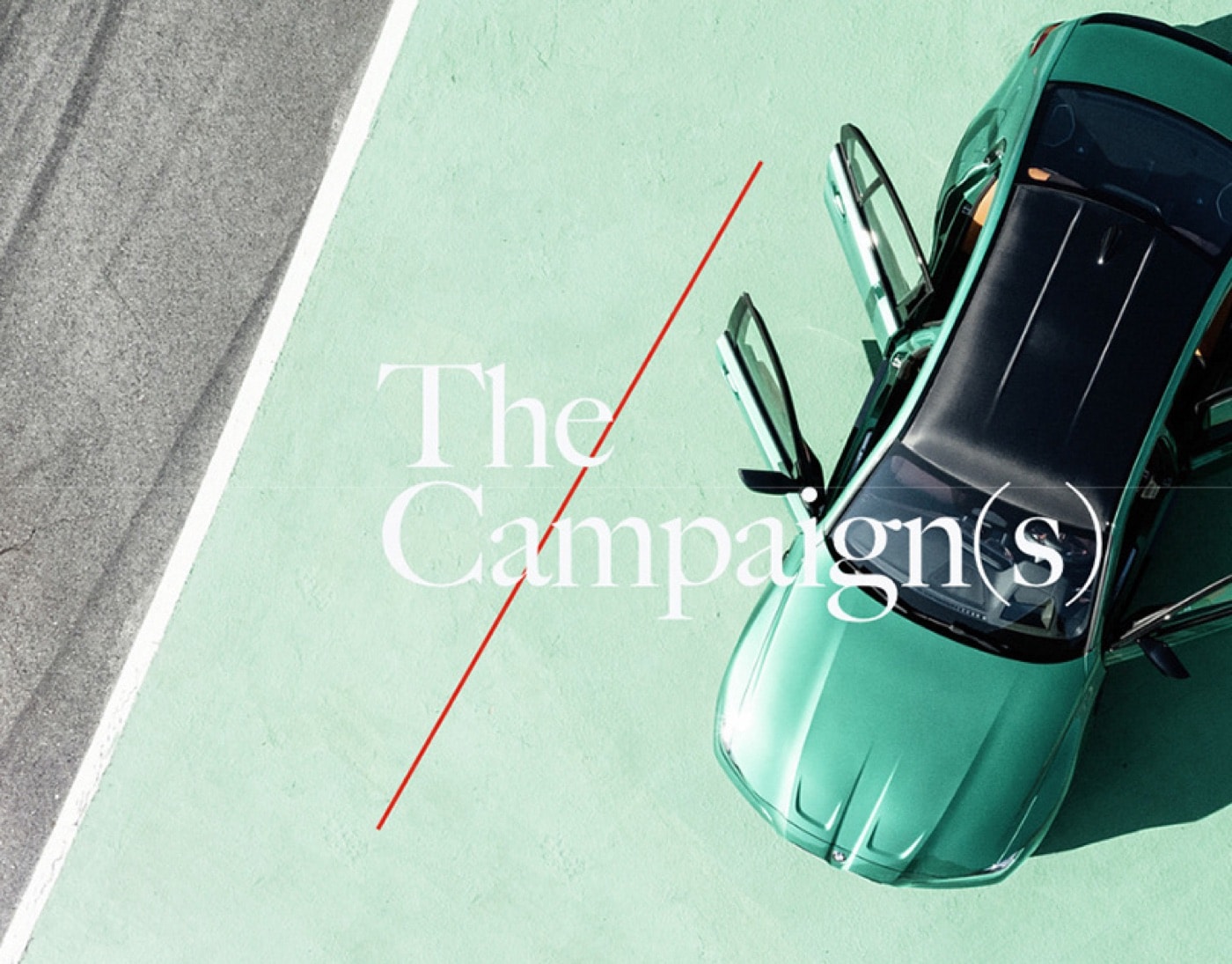
A retail print campaign concept built around punchier hierarchy and cleaner visual messaging.
01 / THE BRIEF
What the work needed to communicate.
Clarify the business story and create a visual direction that feels credible, distinctive, and ready to work across real customer touchpoints.
02 / THE APPROACH
A system, not an isolated visual.
The project was developed as a connected system, balancing clear hierarchy, considered typography, and practical applications rather than relying on one isolated visual.
03 / SCOPE
Selected project outputs.
- Creative direction
- Visual system
- Core brand applications
- Delivery-ready artwork
04 / THE OUTCOME
What the finished system changed.
A campaign direction that makes the message easier to understand at a glance.
05 / NEXT PROJECT
Need something similar?
Tell us what needs to change and we will recommend the clearest next step.